Branding
Foster Tattoo
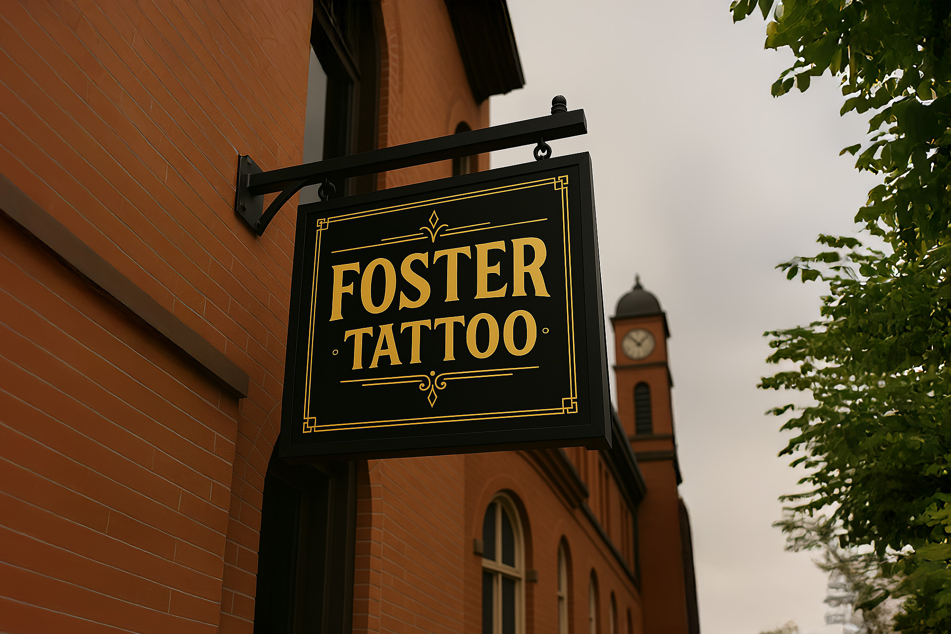
When Foster Tattoo expanded into a historic new space within Bracebridge’s iconic Clock Tower Armoury, the owner envisioned a bold identity that honored the building’s heritage while elevating the client experience. The creative brief called for a modern vintage aesthetic, a blend of sophistication and grit that would feel equally at home in a 1920s speakeasy or a contemporary cigar lounge.
I began with a deep dive into the clock tower’s architecture, drawing inspiration from its art deco details, industrial materials, and local cultural significance. This research informed a visual language rooted in contrast: sharp serif typography paired with burnished gold textures, moody lighting, and ornamental flourishes.
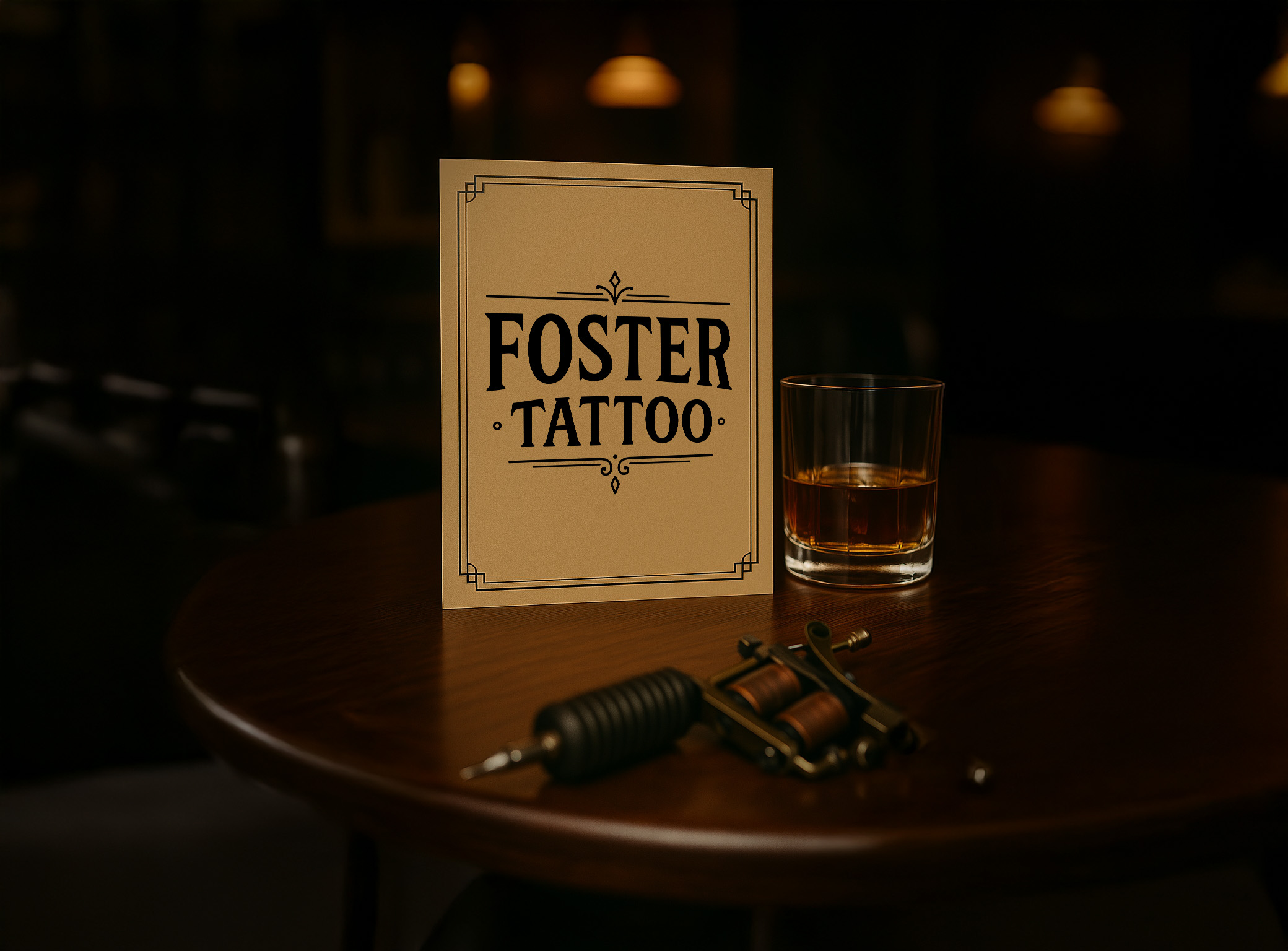
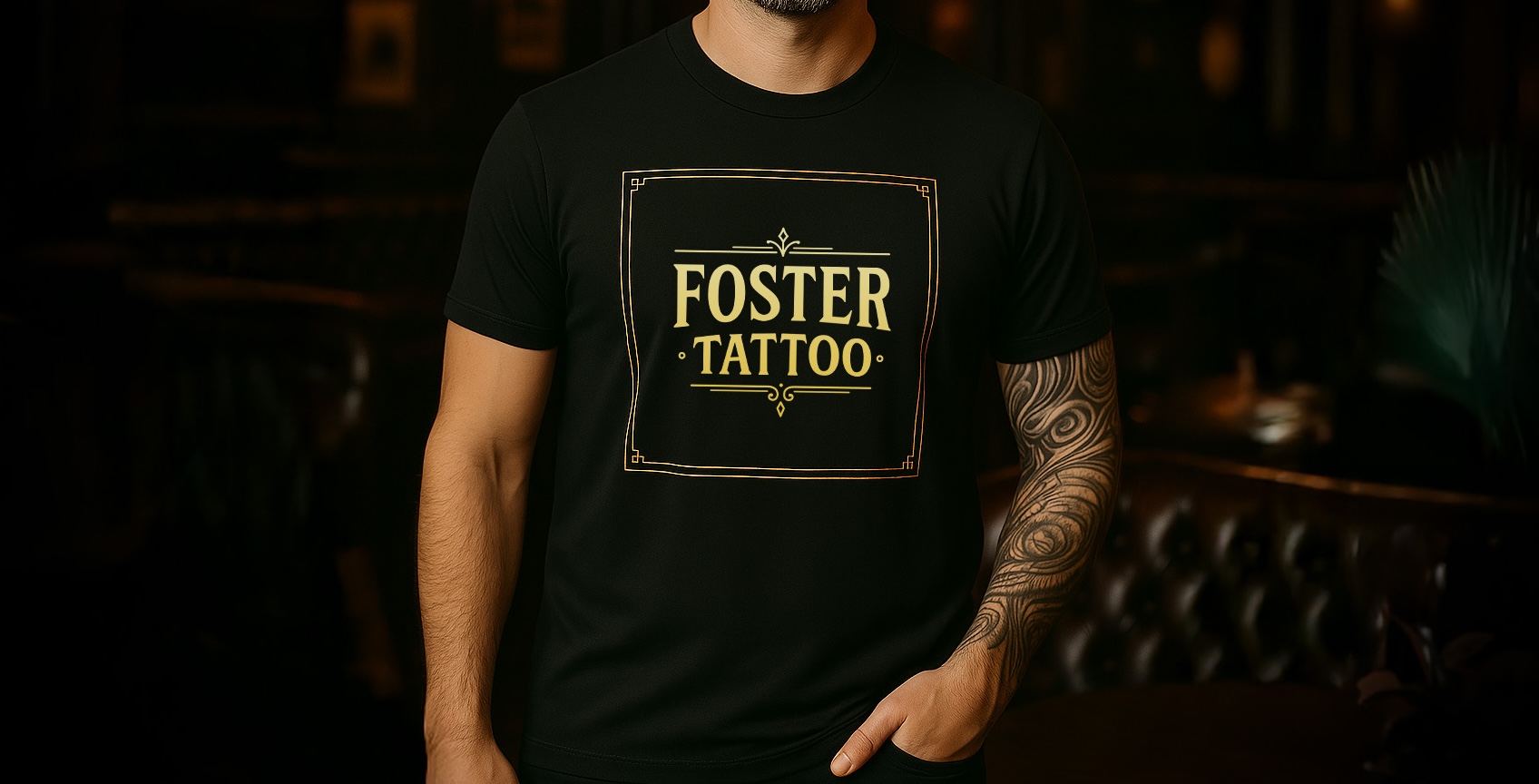
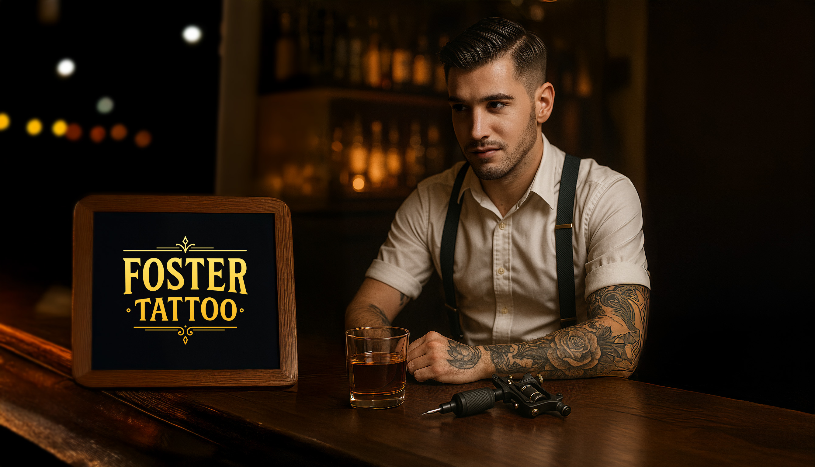
The final brand system balances elegance with edge. Gold foil lettering, atmospheric signage, and a tone that feels both timeless and freshly inked. It sets the stage for a grand opening that celebrates craftsmanship, rebellion, and ritual, everything a great tattoo shop should evoke.
